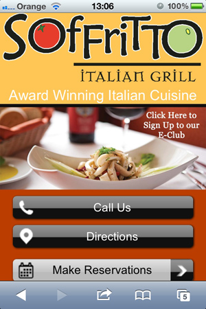
Responsive website design makes it possible for visitors to easily view and navigate a site whether they are viewing it on a desktop, tablet or smart phone. This design approach has become very popular because mobile web access is exploding. Mashable reports that the mobile web will be bigger than the desktop web by 2015.
The mobile web matters tremendously to restaurants, as their sites are exceedingly popular destinations for mobile web users. Among other things, mobile users view restaurant sites for:

• Customer reviews
• Downloadable coupons
• Driving directions
• Hours of operation
• Location
• Making reservations
• Menu items and prices
• Nutritional information
• Ordering takeout
• Phone numbers
Often, people look for this information while in their cars searching for a place to eat. Whether they are hungry or just doing research, a poor mobile website experience drives potential customers away. As more businesses deploy responsive websites, more consumers are refusing to tolerate sites that are clumsy to use on a smart phone or tablet.
Many of the best practices for responsive mobile website design differ from what is typical for a traditional, desktop-driven restaurant site. Keep these design guidelines in mind to make your responsive site a success:
1. Keep it simple. Complicated designs and unnecessary page elements increase page loading time and become annoying distractions on smaller screens. Also remember to keep your patrons in mind. Generally speaking, the older your clientele is, the simpler and larger your site layout should be.
2. Avoid PDF menus. PDF files (or Flash or image versions of your menu) require a lot of resizing, as well as vertical and horizontal scrolling, both bad news for mobile users. A simply laid-out menu on a regular HTML web page that requires only vertical scrolling makes mobile use easy and won’t bother desktop users at all.
3. Make conversion navigation prominent. Use prominent, clearly marked, large navigation buttons for key user destinations such as calling, directions, hours and menus. Size matters for mobile users: Remember, they are using their finger, not a keyboard or mouse, to access navigation items.
4. Include Google Maps. Integrating these maps into your contact or location page makes it easy for users to find you and input directions to your establishment from wherever they are.
5. Keep content to a minimum. Keeping it short and simple is almost always good, but particularly so for mobile users. Few people have the patience to read a 500- or 1,000-word narrative about your restaurant’s history.
6. Handle images with care. Using images in responsive design is tricky. They must be properly sized to display well on smaller screens, and if the file sizes are too large, they slow down page loading. A variety of technical approaches to optimizing images for mobile display are available; if your developer is up to speed on responsive design, image issues are manageable.
More information
(Continued from page 1)
For more information on responsive website design:
• This Pinterest board shows good and bad examples of mobile restaurant sites. It’s a great place to start thinking about design concepts that will work for you.
• Do you know the difference between a mobile site, mobile app and responsive display? This article provides a quick explanation.
• Ready for a deep dive into responsive design? There’s no better place for technical schooling than Smashing Magazine’s responsive guidelines and tutorials.
Brad Shorr is director of B2B marketing for StraightNorth.com, a digital marketing agency providing professional SEO services.


