When Bagby Restaurant Group was building its latest concept, a seasonal American grill in Towson, MD, called Cunningham’s, the company looked for help with more than just the look and feel of the restaurant. It hired Younts Design to design a crucial piece of the package: a new website. Riffing off the new restaurant’s brand identity (which members of the Younts Design team developed for Cunningham’s while with another firm), Younts Design delivered an engaging website intended to enhance the customer experience and facilitate sales. The process incorporated these five practices designed to establish a compelling web presence:
Best practice 1: responsive design
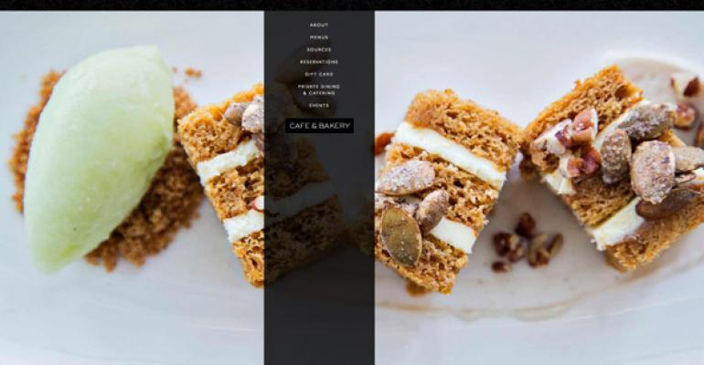
Responsive design is the term for design that scales to whatever device the visitor is using. The desktop view of the website features rich content, including sexy food photography of the restaurant’s mouth-watering dishes, an accordion navigation and downloadable menus. On a tablet, the design adapts slightly, changing layout and proportions to accommodate the screen. The mobile view shifts the design even further and is geared to touchscreen navigation. Text is formatted for maximum legibility and no downloads are required to read the menu. Across platforms, everything is easy to share via one click (or tap) to Facebook, Twitter, Foursquare and Yelp.
Best practice 2: a mobile-first design approach
A “mobile-first” design approach flips the traditional model of designing for the desktop computer first on its head, and instead bases the design on the needs of mobile users. From there, the design is scaled up appropriately for tablet and laptop/desktop users, with additional features such as downloadable menus and rich multimedia added to further enhance the user experience.
Best practice 3: one-step content management
One-step content management that can push updates across devices simultaneously should be a requirement for any new restaurant website. It used to be that if you had a mobile version of your website, you had to manage any changes to that separately from changes to the desktop version. Best practices today dictate a single point where you can make a change once and it cascades across all viewing platforms. Even if a third party manages your website content, the one-step process means faster, more economical updates and less worrying about forgetting to update content on one of your platforms.
Best practice 4: instant access to social media platforms
Easy access to key social media platforms including Yelp, Facebook and Foursquare means instant access to reviews, shares and check-ins. By embedding device-appropriate links to these common social sharing sites and apps, restaurants are tapping the power of personal referrals and getting their name out there to as many potential patrons as possible—a win-win with the power to increase sales exponentially.
Best practice 5: active links
Active links allow Cunningham’s and other restaurants to facilitate desired customer behavior such as calling the restaurant, getting directions or making a reservation. Despite the widespread use of mobile devices, many restaurant websites are not leveraging the opportunities that come from customers who are looking for a place to eat now! With active links to the restaurant phone number, GPS mapping apps or sites and reservation sites like OpenTable, the restaurant’s website design capitalizes on that market and converts hungry prospects to loyal lifetime customers.


